
Giorgi Buzaladze
Data analyst with an academic background in economics and political science, specializing in quantitative methods, survey research, and statistical programming.R Python SQL Power BI Tableau Excel SPSSWelcome to my portfolio!
R and Python

Quantifying Democratic Backsliding
A thesis submitted in fulfillment of the requirements for a master's degree at Yale University. In this project, I use logistic regression to identify predictors of anti-democratic voting in Hungary.R tidyverse ggplot2logistic regression
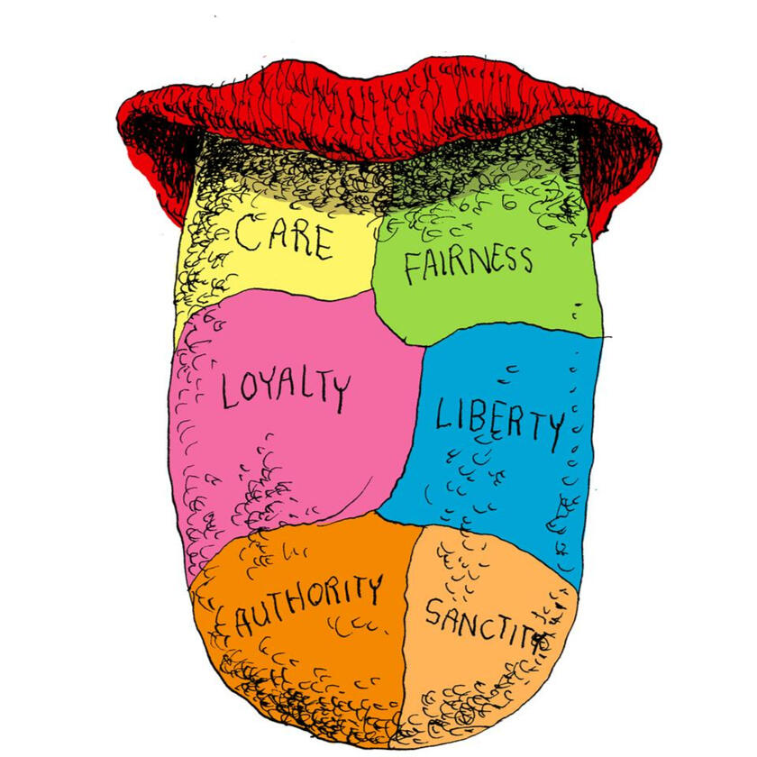
Moral Foundations and Life Outcomes
This project builds upon Jonathan Haidt’s Moral Foundation Theory to explore the relationship between moral foundations and social and economic outcomes across 19 countries.R tidyverse plotlyweb scraping linear regressionfactor analysis

Attitudes towards Dating across Party Lines
In this project, I use the Pew Research Center data to find whether single people are open to dating someone who supports the candidate of the opposing party in the 2016 presidential election.R tidyverse ggplot2survey research

My BJJ (Brazilian Jiu Jitsu) Journey
This project is an attempt to quantitatively and visually document my progression in Brazilian jiu jitsu. The data imported using the Google Cloud API automatically updates the DataCamp workspace and a Looker dashboard.Python pandas plotlyLooker spreadsheets

Classifying Movies
This project uses the k-nearest neighbors algorithm to predict a movie's genre from the text of its screenplay.Python NLPclassification k-NN
Power BI and Tableau
European Social Trends Dashboard
This dashboard provides a visual representation of attitudes, beliefs, and behavior patterns in European countries spanning the last two decades.Power BI Power Query DAXsurvey research

American Trends Panel Dashboard
This dashboard uses data from the Pew Research Center’s American Trends Panel to provide a snapshot of public opinion in the United States.Power BI Power Query DAXsurvey research

Goodreads Dashboard
This dashboard is a visualization of my reading journey from 2016 to mid-2023, using the data downloaded from my Goodreads account.Tableau data visualization

Spotify Top 10 Race Chart
This is an animated race chart of my top 10 artists and songs over time on Spotify.Tableau data visualization
SQL

120 Years of Olympic Wrestling and Judo
This project is an exploration of the captivating history of wrestling and judo in the Olympic games.PostgreSQL seabornexploratory data analysis
Microsoft Excel

Data Visualization Library
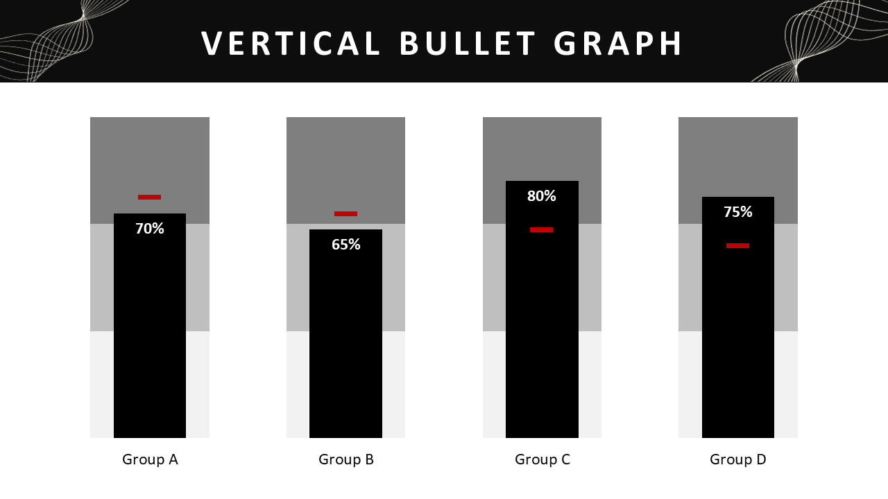
A library of custom Excel charts that are less intuitive to make. Simply download the PowerPoint file from my Dropbox and input the numbers to generate the charts!Excel data visualization
Writing

INNOVATIVE Blog Posts
These are the public opinion pieces I've published on my current company's website. I've led these studies end-to-end from survey design to writing articles.SPSS survey designdata storytelling writing

The Role of Global Health Diplomacy in Advancing the Sustainable Development Goals
This policy brief is my publication in International Journal, co-authored with Andrew Defor. While not strictly a data analytics project, it’s still a project I’m very proud of.policy development writing
My Education
Master of Arts (MA) in European and Russian Studies
Yale University | 2022Bachelor of Arts (BA Hons) in Economics and Political Science
University of Toronto | 2019

Cultural Backlash vs. Economic Self-Interest:
Democratic Backsliding in Hungary
This essay attempts to explain the underlying reasons behind liberal democracy breaking down in wealthy countries of Central and Eastern Europe, despite early successful post-communist transitions. It distinguishes between demand- and supply-side explanations of democratic backsliding and conducts a quantitative analysis of public opinion in Hungary to test the validity of a popular demand-side explanation put forward by political scientists Ivan Krastev and Stephen Holmes.The data collected through European Social Survey, World Values Survey, and Global Attitudes Survey show that the conventional wisdom about an anti-democratic, anti-migrant, anti-EU, and anti-liberal crisis in Hungary is strikingly at odds with public opinion.Using a logistic regression model, this study finds that economic self-interest is a far stronger predictor of anti-democratic voting than cultural or political attitudes proposed by Krastev and Holmes. Hungarian voters do not deliberately vote for authoritarianism. They reward their right-wing populist leader for economic growth, putting democracy in the backseat.This project, under the advisorship of Milan Svolik, was submitted in fulfillment of the requirements for a master's degree at Yale University. The original essay, along with the R script for data visualization and analysis, can be accessed through the links provided on the home page.

Moral Foundations and Life Outcomes:
A Cross-Cultural Study
This project builds upon the theory outlined by the social scientist Jonathan Haidt in my favorite book, The Righteous Mind: Why Good People are Divided by Politics and Religion.Haidt's moral foundations theory seeks to explain the origins of and variation in human moral reasoning on the basis of five underlying foundations: Care, Fairness, Loyalty, Authority, and Sanctity. Haidt's research shows that Liberals and Conservatives have different moral palates. Liberals rely heavily on Care and Fairness foundations while Conservatives rely on all five foundations somewhat equally.My goal in this project is to compare moral palates across different countries and determine how Haidt's five moral foundations influence social and economic outcomes, as measured by the Human Development Index (HDI). I set the context for the study by exploring sex differences across moral foundations on a global scale and analyzing how these differences may vary from one country to another.Using confirmatory factor analysis and linear regression, I show that a cluster of binding foundations (Loyalty, Authority, and Sanctity) has a statistically significant negative relationship with social and economic outcomes, while a cluster of individualizing (Care and Fairness) foundations is not statistically significant.The data used in this project has been gathered for a Stanford study of sex differences around the world.In this project, I use tidyverse for data cleaning and transformation, rvest for web scraping, and plotly for data visualization.

Swipe Left or Swipe Right? Attitudes towards Dating across Party Lines
In this project, I delve into an intriguing aspect of dating preferences among single individuals.I use the survey data obtained by Pew Research Center to determine whether single people looking for a relationship would be open to dating someone who supports or voted for the candidate of the opposing party in the 2016 presidential election.This study sheds light on the role of political affiliations in modern dating and uncovers insights into the dynamics of relationships in today's politically charged climate.Using tidyverse functions, I transform Pew Research Center’s vote and relationship variables to define a ‘dater’ (a single individual looking for a committed or casual relationship) and create distinct categories for Democrats, Clinton voters, Republicans, and Trump voters.As a result, I arrive at estimates for Democrats’ openness toward dating Republicans and Trump voters, as well as Republicans’ openness toward dating Democrats and Clinton voters.The project concludes with a ggplot2 visualization summarizing the findings among Democrats and Republicans.We find that Republicans are more open towards dating individuals from different party lines compared to Democrats. Democrats are particulary unwilling to date Trump voters.

My BJJ (Brazilian Jiu Jitsu) Journey
This project is an attempt to quantitatively and visually document my progression in Brazilian jiu jitsu.My goal with this project is to quantify my fighting style, identify strengths and weaknesses, and use that information to set goals and prioritize areas of improvement in my training. The visualizations generated in this project help me answer questions such as what are my preferred submissions, how am I most frequently submitted, which positions do I tend to favor, and if there are any positions from which my defensive abilities are comparatively weaker. Submissions and positions are complemented with contextual information such as my belt rank, my opponent's belt rank, and whether a submission was in gi or no gi training.The dataset I am working with is being manually constructed by me using Google Sheets and imported to Python workspace using the Google Cloud API. The workspace automatically updates as I log my training sessions.While the workspace acts as a controlled environment for my data exploration, I have developed a Looker dashboard that offers an in-depth, interactive overview of my BJJ journey.I plan to continuously add and refine my analysis as data adds up, but above all, I envision this project evolving into a "business" intelligence tool that I can consult as I continue to progress with my training.

Classifying Movies
In this project, I build a classification model that predicts a movie's genre (action or romance) from the text of its screenplay.The dataset I'm working with contains a corpus of text containing fictional dialogues extracted from 617 raw movie scripts.I begin by preprocessing the data (stemming) and splitting the dataset into training and test sets. I then select 20 features – discriminative words that are common in action movies but uncommon in romance movies and vice-versa.Once features are selected, I build the classifier function using the k-nearest neighbors (k-NN) algorithm, a supervised machine learning technique that assigns labels to data points based on their proximity to their k nearest neighbors in the feature space.The classifier performs with 81% accuracy.

European Social Trends Dashboard
This dashboard is an extension of my master's thesis and provides a visual representation of attitudes, beliefs, and behavior patterns in European countries spanning the last two decades. The data have been gathered biennially from 2002 to 2020 by the European Social Survey (ESS), a pan-European research institute providing freely accessible data for academics, policymakers, civil society, and the general public. All ten rounds of ESS surveys are accessible through the ESS Data Portal.The ESS uses cross-sectional, probability samples which are representative of all persons aged 15 and over residing within private households in each country. Click here to view the full ESS methodology.This dashboard features a country filter and is designed to provide a detailed country profile, focusing (in most cases) on individual nations rather than offering a comparative analysis of European countries.

American Trends Panel Dashboard
American Trends Panel dashboard is an interactive data visualization project built in Power BI using Pew Research Center’s nationally representative online survey. It provides a snapshot of the ever-evolving landscape of public opinion in the United States.In this dashboard, I have chosen to consolidate what I consider to be three of the most important variables from a much more extensive survey. These variables include party identification (Democrat/Republican), federal government favorability, and the list of top national problems. Accompanying these three variables are demographic/ideological slicers, which enable users to easily filter the data.The current dashboard is based on Wave 107 (Spring 2022), but Pew Research Center conducts this survey approximately ten times a year, allowing the dashboard to be readily replicated for a different wave.You can access Pew Research Center's ATP datasets for download here.

Goodreads Dashboard
This Tableau dashboard illustrates my reading journey from 2016 to mid-2023, using data imported from my Goodreads account.I've been an avid reader since the summer following my high school graduation – basically, when I was no longer forced to read books. Some of the questions I wanted to answer using this dashboard were how much fiction versus non-fiction I read, which genres I read the most, my preferred genres, which authors I read the most, and how my book ratings compare to those of other people.The line chart in this dashboard shows that I started off primarily as a fiction reader but started reading a lot more non-fiction books later on, particularly during the initial COVID-19 lockdowns, during which we see a big bump in the line chart. I would easily read a book about every two or three days at that time.I love how neatly the 80/20 rule applies here. 95 out of the 405 books I’ve read were marked as favorites, which is slightly above 20%.My two most-read genres are history and political science, which likely have something to do with the fact that I studied social science. I’ve also read a lot of classic fiction and psychology, which is mostly what I like to read outside of the classroom.I’ve read most books from the Japanese fantasy writer Haruki Murakami – easily my favorite fiction writer.Finally, although the line chart goes flat starting from 2023, I haven’t actually stopped reading. Lately, I’ve been mostly reading statistics and data science books, which I chose not to record on Goodreads.

Spotify Top 10 Race Chart
Definitely a crowd favorite, this project is an animated race chart showing my top 10 artists and songs over time on Spotify, created using Tableau.One of the cool ways to obtain interesting datasets is by downloading a copy of your personal data from the apps you frequently use. This way, you can visualize trends related to the specific app’s content. There’s no app I’ve used more than Spotify, and fortunately, you can download your Spotify data by following these instructions.Spotify data contains information about your streaming history, including artist, song, and album names, as well as the date and time when the stream started and ended, among other details. Since I’ve created this chart for a few of my friends as well, I’ve shared a data cleaning file on my Kaggle notebooks that transforms the freshly downloaded Spotify data into a dataset ready to be visualized in Tableau.To view your top 10 artists and songs in three-year intervals from the moment you started using Spotify, simply click the 'Play Forward' arrow in the box.What do we learn from my data? My Spotify journey began in 2016 when I moved from Georgia to Canada (Spotify wasn't available in Georgia at that time). During this period, I was deeply immersed in hip-hop, which also happened to be very popular in North America. It's no surprise that, while living in Canada, I listened to A LOT of Drake.From 2020, during the initial lockdowns, you can see reggaeton taking over for more than a full year. Following that, my musical preferences shifted to a mix of indie rock and hip-hop. However, it’s worth noting that I’ve been listening to significantly less music since late 2022 and onwards.

120 Years of Olympic Wrestling and Judo
This project is an exploration of the captivating history of wrestling and judo in the Olympic games, using SQL as a primary tool for analysis.I work with a dataset covering the modern Olympic Games, which contains information about Olympians who have participated in every sport and event held in the Summer and Winter Olympics from Athens 1896 to Rio 2016.I delve into questions such as which countries and athletes have achieved the most success in Olympic wrestling and judo, which countries demonstrate the highest level of efficiency, how many different Olympic games the athletes participate in over their careers, and whether the medal winners tend to participate in more or fewer games. Additionally, I look at the list of most decorated athletes from my home country, Georgia, where combat sports are exceptionally popular.In this project, I make use of a range of intermediate to advanced SQL techniques, including:Aggregate functions
CASE statements
JOINs
CTEs (Common table expressions)
Subqueries
Window functionsGiven that this is primarily a SQL project, I present the results in table format. In cases where it’s absolutely necessary, I use Python’s seaborn library for data visualization.
Data Visualization Library
In the company where I work, we deliver PowerPoint reports for nearly every client project. Sometimes, we need to go beyond default Excel charts to effectively present our findings. I noticed that building these charts from scratch or working with templates downloaded online was costing us a lot of extra manual labor.With the help of Stephanie Evergreen’s book, “Effective Data Visualization: The Right Chart for the Right Data,” I created the Data Visualization Library. This library is a collection of custom Excel charts that aren’t very intuitive to make, including but not limited to gauge charts, overlapping charts, bullet graphs, dot plots, and diverging stacked bar charts.Simply download the PowerPoint file from my Dropbox and input the necessary numbers to generate the charts!
INNOVATIVE Blog Posts
In the company where I work, we conduct a monthly national omnibus survey that includes core political questions (voting preferences, government satisfaction, etc.), client-purchased questions, and questions related to breaking news. Additionally, each month, we select a special topic for a more in-depth exploration based on its relevance to the country and our clients.As a content manager, I lead the end-to-end research cycle for these special topics. This typically involves selecting the topic, designing the study, developing the questionnaire, handling data cleaning and weighting, creating the report, and writing a blog post with our findings for the company website. We primarily use SPSS for data analysis.The topics I've worked on range from a deep dive into housing, crime, and homelessness in Canada to a seat distribution forecast for the upcoming federal election.

The Role of Global Health Diplomacy in Advancing the Sustainable Development Goals
This is my policy brief, co-authored with Andrew Defor, which was published in one of the leading Canadian scientific journals, International Journal.This paper reviews the successes and failures of the health-related Millennium Development Goals. It uses the lessons learned to put forward a sustainable approach toward the Sustainable Development Goals, and explores the role of Global Health Diplomacy in advancing the health goals.